Visualization: Creating figures
The Visualization module provides plotting functionality for creating figures from experiment and analysis results.
This includes plotter and drawer classes to plot data in CurveAnalysis and its subclasses.
Plotters define the kind of figures to plot, while drawers are backends that enable them to be visualized.
How much you will interact directly with the visualization module depends on your use case:
Running library experiments as-is: You won’t need to interact with the visualization module.
Running library experiments with custom styling for figures: You will be setting figure options through the plotter.
Making plots using a plotting library other than Matplotlib: You will need to define a custom drawer class.
Writing your own analysis class: If you want to use the the default plotter and drawer settings, you don’t need to interact with the visualization module. Optionally, you can customize your plotter and drawer.
Plotters inherit from BasePlotter and define a type of figure that may be generated from
experiment or analysis data. For example, the results from CurveAnalysis — or any other
experiment where results are plotted against a single parameter (i.e., \(x\)) — can be plotted
using the CurvePlotter class, which plots X-Y-like values.
These plotter classes act as a bridge (from the common bridge pattern in software development) between
analysis classes (or even users) and plotting backends such as Matplotlib. Drawers are the backends, with
a common interface defined in BaseDrawer. Though Matplotlib is the only officially supported
plotting backend in Qiskit Experiments through MplDrawer, custom drawers can be
implemented by users to use alternative backends. As long as the backend is a subclass of
BaseDrawer, and implements all the necessary functionality, all plotters should be able to
generate figures with the alternative backend.
Generating and customizing a figure using a plotter
First, we display the default figure from a T1 experiment as a starting point:
Note
This tutorial requires the qiskit-aer
package to run simulations. You can install it
with python -m pip install qiskit-aer.
import numpy as np

from qiskit_ibm_runtime.fake_provider import FakeManilaV2
from qiskit_aer import AerSimulator

from qiskit_experiments.library import T1


seed = 100
backend = AerSimulator.from_backend(FakeManilaV2())

delays = np.arange(1.e-6, 300.e-6, 30.e-6)
t1_exp = T1(physical_qubits=(0, ), delays=delays, backend=backend)

t1_data = t1_exp.run().block_for_results()
t1_data.figure(0)
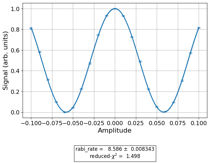
This is the default figure generated by T1Analysis, the data analysis
class for the T1 experiment. The fitted exponentail is shown as a blue line, with the
individual measurements from the experiment shown as data points with error bars corresponding
to their uncertainties. We are also given a small fit report in the caption showing the
T1.
The plotter that generated the figure can be accessed through the analysis instance, and customizing the figure can be done by setting the plotter’s options. We now modify the color, symbols, and size of our plot, as well as change the axis labels for the amplitude units:
# Retrieve the plotter from the analysis instance
plotter = t1_exp.analysis.plotter

# Change the x-axis unit values
plotter.set_figure_options(
    xval_unit="arb.",
    xval_unit_scale=False   # Don't scale the unit with SI prefixes
)

# Change the color and symbol for the exponential
plotter.figure_options.series_params.update(
    {"exp_decay": {"symbol": "x", "color": "r"}}
)

# Set figsize directly so we don't overwrite the entire style
plotter.options.style["figsize"] = (6,4)

# Generate the new figure
plotter.figure()
Plotters have two sets of options that customize their behavior and figure content:
options, which have class-specific parameters that define how an instance behaves,
and figure_options, which have figure-specific parameters that control aspects of the
figure itself, such as axis labels and series colors.
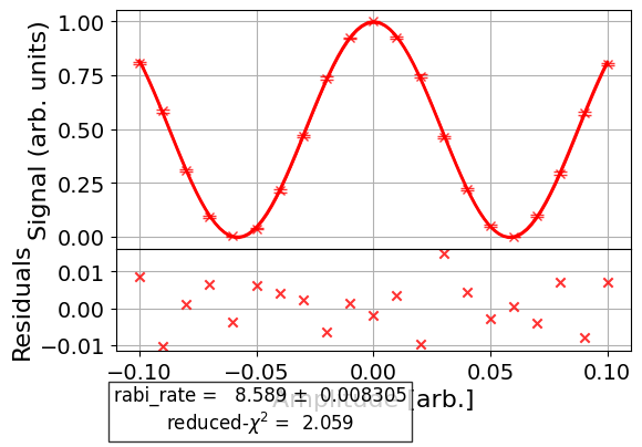
To see the residual plot, set plot_residuals=True in the analysis options:
# Set to ``True`` analysis option for residual plot
t1_exp.analysis.set_options(plot_residuals=True)

# Re-run analysis
t1_data_res = t1_exp.analysis.run(t1_data).block_for_results()
t1_data_res.figure(0)
This option works for experiments without subplots in their figures.
Here is a more complicated experiment in which we customize the figure of a Ramsey XY experiment before it’s run, so that we don’t need to regenerate the figure like in the previous example. First, we run the experiment without customizing the options to see what the default figure looks like:
import numpy as np

from qiskit_experiments.library import RamseyXY
from qiskit_experiments.test.t2hahn_backend import T2HahnBackend


seed = 100
backend = T2HahnBackend(frequency=1e5, seed=seed)

delays = np.linspace(0, 10.e-7, 21)
exp = RamseyXY((0,), backend=backend, delays=delays, osc_freq=2.0e6)

exp_data = exp.run().block_for_results()
exp_data.figure(0)
Now we specify the figure options before running the analysis for a second time:
# Set plotter options
plotter = exp.analysis.plotter

# Update series parameters
plotter.figure_options.series_params.update(
    {
        "X": {
            "color": (27/255, 158/255, 119/255),
            "symbol": "^",
        },
        "Y": {
            "color": (217/255, 95/255, 2/255),
            "symbol": "s",
        },
    }
)

# Set figure options
plotter.set_figure_options(
    xval_unit="arb.",
    xval_unit_scale=False,
    figure_title="Ramsey XY Experiment on Qubit 0",
)

# Set style parameters
plotter.options.style["symbol_size"] = 10
plotter.options.style["legend_loc"] = "upper center"

exp_data2 = exp.analysis.run(exp_data).block_for_results()
exp_data2.figure(0)
As can be seen in the figure, the different series generated by the experiment
were styled differently according to the series_params attribute of figure_options.
By default, the supported figure options are xlabel, ylabel, xlim, ylim,
xval_unit, yval_unit, xval_unit_scale, yval_unit_scale, xscale, yscale,
figure_title, and series_params; see MplDrawer for details on how to set these
options. The following block uses the previous T1 experiment to provide examples
of options that have not been demonstrated until now in this tutorial:
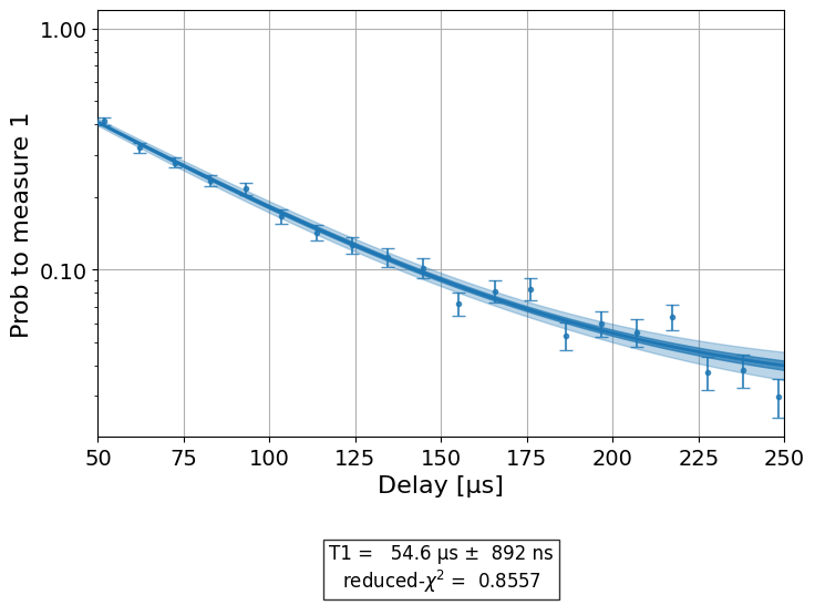
t1_exp.analysis.set_options(plot_residuals=False)
plotter = t1_exp.analysis.plotter

plotter.set_figure_options(
    ylabel="Prob to measure 1",
    xlim=(50e-6, 250e-6),
    yscale="log"
)

plotter.figure()
Customizing plotting in your experiment
Plotters are easily integrated into custom analysis classes. To add a plotter instance
to such a class, we define a new plotter property, pass it relevant data in the
analysis class’s _run_analysis method, and return the generated figure alongside our
analysis results. We use the IQPlotter class to illustrate how this is done for an
arbitrary analysis class.
To ensure that we have an interface similar to existing analysis classes, we make our plotter
accessible as an analysis.plotter property and analysis.options.plotter option.
The code below accomplishes this for our example MyIQAnalysis analysis class. We
set the drawer to MplDrawer to use matplotlib by default. The plotter property of our
analysis class makes it easier to access the plotter instance; i.e., using self.plotter
and analysis.plotter. We set default options and figure options in
_default_options, but you can still override them as we did above.
The MyIQAnalysis class accepts single-shot level 1 IQ data, which consists of an
in-phase and quadrature measurement for each shot and circuit. _run_analysis is
passed an ExperimentData instance which contains IQ data as a list of dictionaries
(one per circuit) where their “memory” entries are lists of IQ values (one per shot).
Each dictionary has a “metadata” entry, with the name of a prepared state: “0”, “1”,
or “2”. These are our series names.
Our goal is to create a figure that displays the single-shot IQ values of each
prepared-state (one per circuit). We process the “memory” data passed to the
analysis class and set the points and centroid series data in the plotter.
This is accomplished in the code below, where we also train a discriminator
to label the IQ points as one of the three prepared states. IQPlotter supports
plotting a discriminator as optional supplementary data, which will show predicted
series over the axis area. For a similar working example, see
MultiStateDiscriminationAnalysis.
from qiskit_experiments.data_processing import BaseDiscriminator
from qiskit_experiments.framework import AnalysisResult, BaseAnalysis, Options
from qiskit_experiments.visualization import (
    BasePlotter,
    IQPlotter,
    MplDrawer,
)


class MyIQAnalysis(BaseAnalysis):
    @classmethod
    def _default_options(cls) -> Options:
        options = super()._default_options()
        # We create the plotter and create an option for it.
        options.plotter = IQPlotter(MplDrawer())
        options.plotter.set_figure_options(
            xlabel="In-phase",
            ylabel="Quadrature",
            figure_title="My IQ Analysis Figure",
            series_params={
                "0": {"label": "|0>"},
                "1": {"label": "|1>"},
                "2": {"label": "|2>"},
            },
        )
        return options

    @property
    def plotter(self) -> BasePlotter:
        return self.options.plotter

    def _analysis_result(self, datum: dict) -> AnalysisResult:
        # Analysis result calculation can be done here
        raise NotImplementedError

    def _train_discriminator(self, data: list[dict]) -> BaseDiscriminator:
        # Discriminator training can be done here
        raise NotImplementedError

    def _run_analysis(self, experiment_data):
        data = experiment_data.data()
        analysis_results = []
        for datum in data:
            # Analysis code
            analysis_results.append(self._analysis_result(datum))

            # Plotting code
            series_name = datum["metadata"]["name"]
            points = datum["memory"]
            centroid = np.mean(points, axis=0)
            self.plotter.set_series_data(
                series_name,
                points=points,
                centroid=centroid,
            )

        # Add discriminator to IQPlotter
        discriminator = self._train_discriminator(data)
        self.plotter.set_supplementary_data(discriminator=discriminator)

        return analysis_results, [self.plotter.figure()]
If we run the above analysis on some appropriate experiment data, as previously described, our class will generate a figure showing IQ points and their centroids.
Creating your own plotter
You can create a custom figure plotter by subclassing BasePlotter and overriding
expected_series_data_keys(),
expected_supplementary_data_keys(), and
_plot_figure().
The first two methods allow you to define a list of supported data-keys
as strings, which identify the different data to plot. The third method,
_plot_figure(), must contain your code to generate a figure by calling methods
on the plotter’s drawer instance (self.drawer). When plotter.figure() is called
by an analysis class, the plotter calls _plot_figure() and then returns your figure
object which is added to the experiment data instance. It is also good practice to
set default values for figure options, such as axis labels. You can do this by
overriding the _default_figure_options() method in your plotter subclass.
See also
API documentation: Visualization Module